
Brand Identity for San Francisco’s Devtool Padel Tournament
dev_tools.padel() is a padel tournament for devtool founders and investors in San Francisco. KOJI partnered with CodeRabbit and Evil Martians to create the brand identity and visual communication for this startup-focused event.
Why padel? San Francisco is tired of technical meetups! To support this out-of-the-box event idea, the brand identity needed to feel natural to both worlds behind the tournament: padel and developer-facing startups. Instead of simply combining familiar sports and tech references, we built a visual system where the same graphic elements can be read in both contexts.
Visual System
KOJI built dev_tools.padel() identity in three graphic layers.
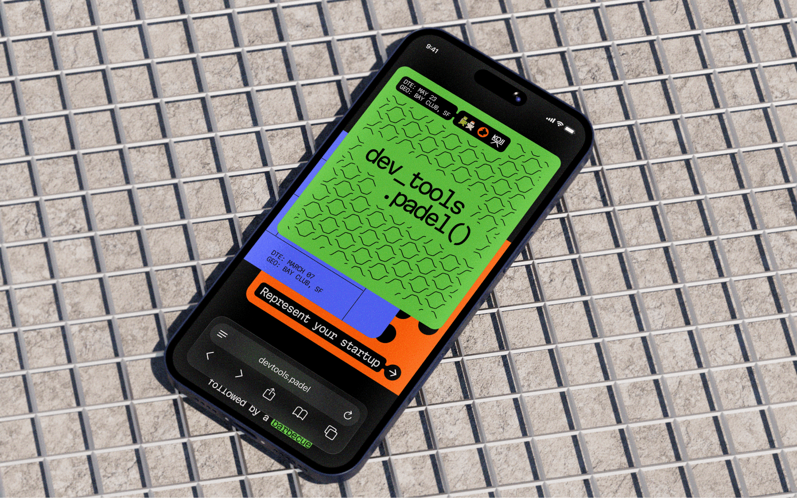
The green layer comes from the perforated surface of a padel racket. At the same time, it references a punch card — an early physical medium for storing and processing code. The orange layer is based on the net dividing the padel court, with its pattern also referencing binary code. The blue layer comes from the geometry of the court, while also reading as a terminal screen or software interface.
We designed thehe layers to work together in different combinations. When the green perforation is placed over the orange pattern, for example, their intersection creates padel balls. By rearranging, scaling, and overlapping the three elements, we can build a wide range of compositions from the same visual logic.
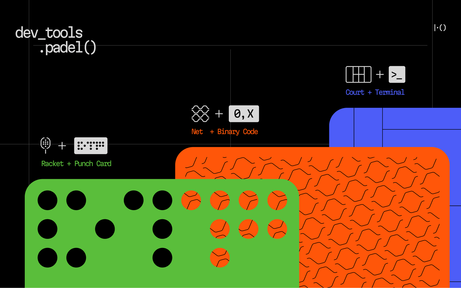
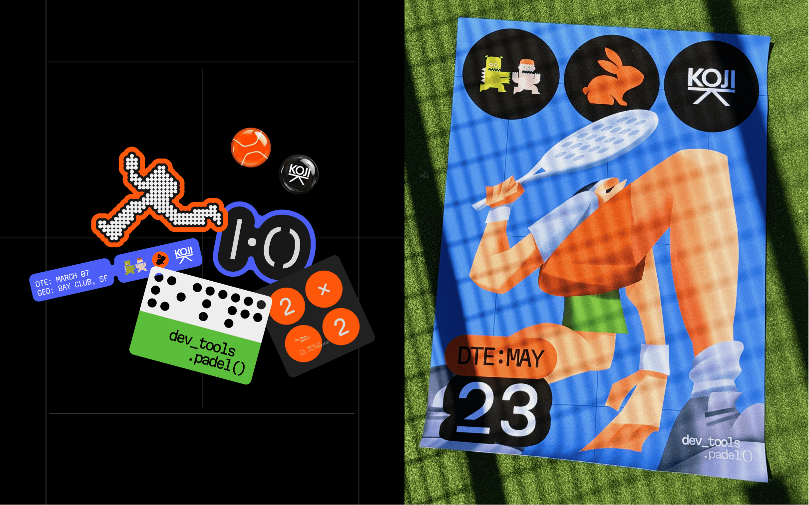
The identity also includes the compact |·() symbol, which connects the two contexts in another way: it can be read as a padel score while also referencing programming syntax. It is not the main source of recognition, and many applications work without it — the graphic system itself carries the identity.
Typography is based on Martian Mono, a monospaced typeface created by our partners at Evil Martians — a variable open-source font built specifically for developer interfaces. It brings the language of development into the system and works directly with the layered graphic compositions.
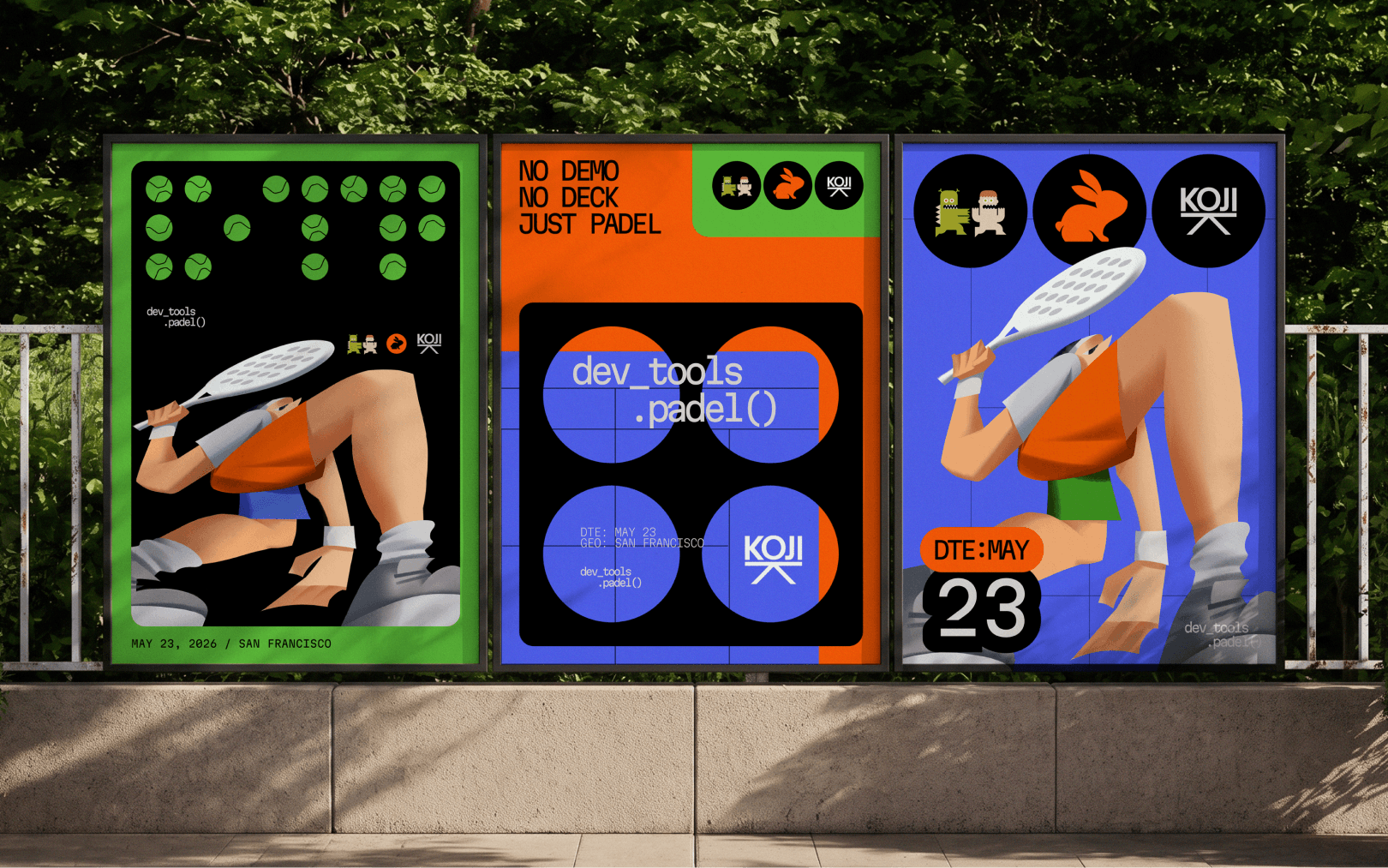
Illustration is added to the creatives to bring people, movement, and character into the system. Exaggerated proportions and dynamic poses contrast with the more structured graphic language and work naturally alongside the layers and typography.
Communication
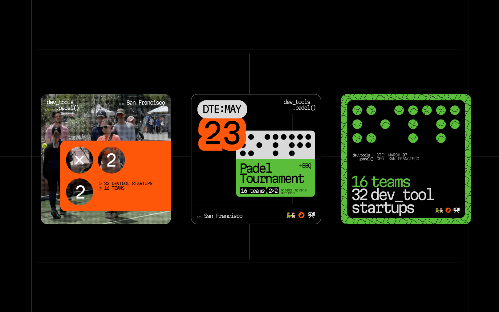
The visual system was designed to produce varied communication without relying on fixed layouts. The three layers, typography, and illustrations can be recombined across formats while keeping the identity recognizable.
This approach carries through digital announcements and social media, as well as posters, outdoor placements, venue graphics, and other physical applications around the city.
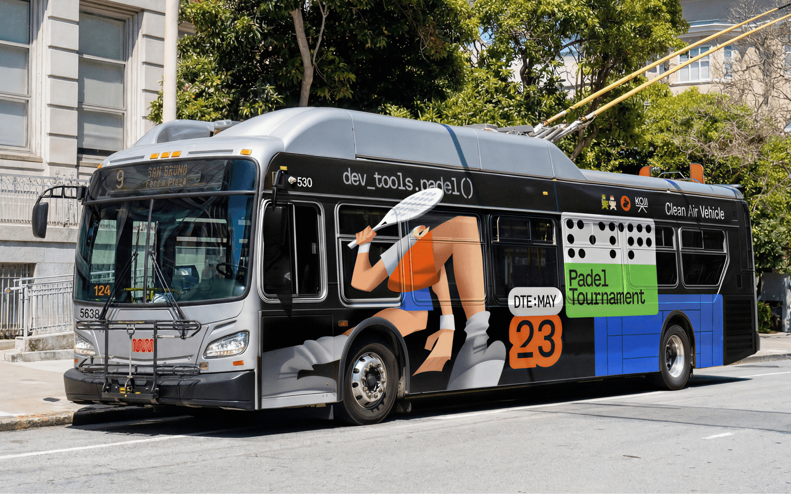
The perforation embedded in the identity also creates opportunities beyond flat graphics. On merchandise, it becomes a physical element of the object itself: holes, layered materials, and contrasting surfaces translate the racket and punch-card metaphor into the construction of bags and other pieces.
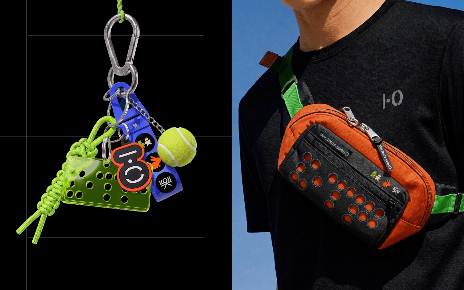
Rather than placing the same logo on every touchpoint, the identity gives dev_tools.padel() a set of recognizable elements that can change with the medium — from a social post or city poster to an object you can wear.
Results
A flexible identity across digital, outdoor, venue, and merch.
2
weeks to build and roll out the brand identity
15
founders and VCs signed up for the event

Pasha Dergachev
If your team produces
creatives at volume and feel the squeeze between cost, speed, and brand consistency, KOJI can help. Book a 15-minute call.